Did you know that there's this thing called "Accessibility Standards" and governs how well people can read your content online?
WHAT IS CONTRAST ACCESSIBILITY?
For trained designers it's key that we check our designs for these accessibility standards and frequently ask ourselves questions like "will everyone be able to understand, see and engage with this?" For the average person though, things like accessibility standards probably seem about as exciting as hearing how your washing machine works...
WHY SHOULD YOU CARE?
Because nobody likes a bully. When we create things that might LOOK BEAUTIFUL but might be hard to read for others, we are unintentionally setting someone with poor/low-vision up to feel frustrated and left out. The hard part here is that none of us are obviously trying to be bully's be exercising our AMAZING EYE SIGHT and keen eye for colour coordination... the trouble lies in the lack of consideration for those that don't have it.
HOW DO YOU TEST IT?
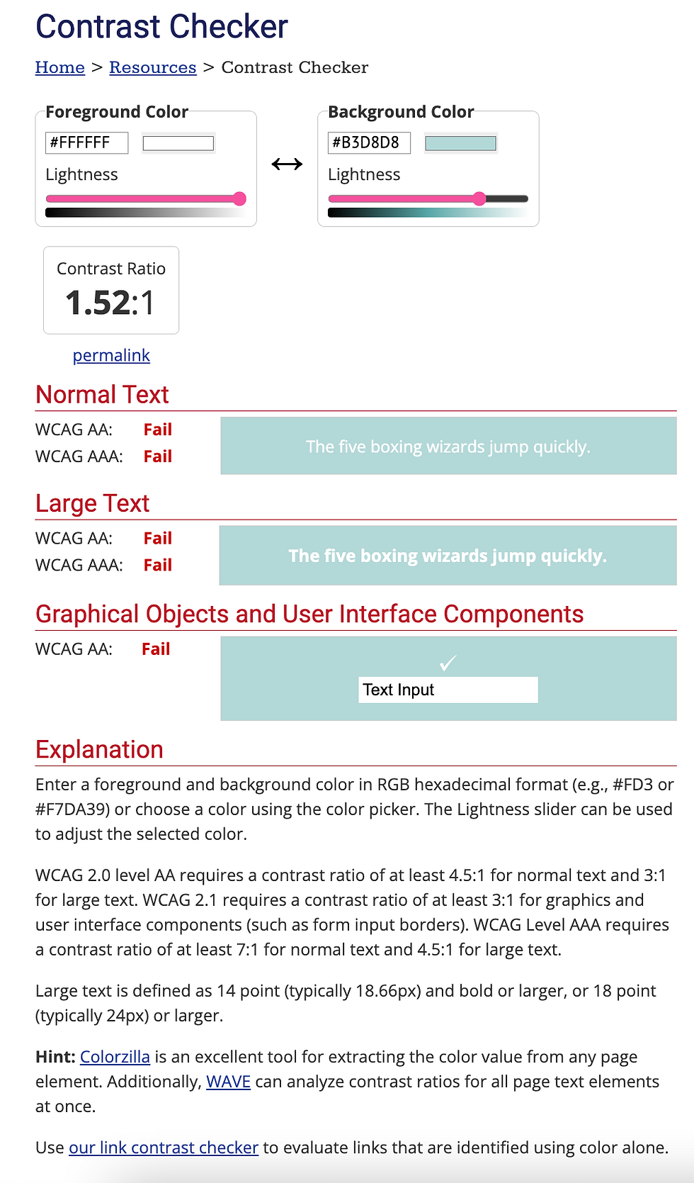
Here's a recent example of something I designed that I loved the look and feel of –but had a gut feeling that it wouldn't pass accessibility standards (see screenshot below) so I went to use a helpful online "Accessibility Contrast Checker" and sure enough the design failed..


WHAT CAN YOU DO ABOUT IT?
The contrast between the thin white lettering and light blue background looked great to me, but to those with poor eye-sight it would've been too hard to distinguish. So I opted to increase the contrast and choose legibility over beauty (see updated screenshot below). Now my text is black and much easier to read, even if I feel like it looked better when it was all white and 'stylized'. To help with the "softness" of the design I changed the black to a dark grey.

THINGS TO REMEMBER:
The general rule of thumb is that you want at least 70% contrast. A good way to figure this is out is to take two colours (like black and white) and add or subtract 30% of it's black/white value ("add 30% more white to the black, creating a 70% contrast when seen on white").
Another great way to "see" this in the eyes of someone who might have low-quality vision is to take a picture of your design and suck all the colour out ("desaturate") so you can distinctly see ONLY the contrast between elements. The average person can do this very easily by opening up an image in Canva's free image editor and desaturating it:

SIDE BY SIDE EXAMPLES:
Look at these two images and let me know which one is easier for you to read:


NEXT STEPS:
Now that you know a little bit more about CONTRAST and ACCESSIBILITY STANDARDS the next step is to simply be aware of "how easy is this to read" next time you design something for the online world. It makes a big difference when we're looking out for each other out here 💕

Thanks for some tips! I think they will really help many novice bloggers. Don't forget about the software that will help you edit your videos. You will definitely need an editor and converter to work with videos. professional video editing software can help you if you want to know more about it. By the way, please give me a link to your yt.